Lo Spettro Hot Sauce: A Case Study
Brand: Lo Spettro Sauce Co.
Flavors: Hellapeño • Justy Peachy • Piñalero
Timeline: 2 weeks
Role: Illustration, Logo Integration, Label Design
Overview
Lo Spettro Sauce Co. needed a label system that matched the personality of its bold, fruit-forward hot sauces. The solution was a character-driven design centered around the brand’s ghost mascot — a playful, expressive figure that visually ties the lineup together while allowing each flavor to stand apart.
Design Objectives
Build a strong, cohesive brand family across three distinct flavors.
Communicate flavor profiles visually through color, ingredients, and tone.
Keep the designs fun, approachable, and recognizable at a glance.
Translate the mascot and ingredients cleanly into print-ready vector labels.
Key Design Elements
1. The Ghost Mascot (Series Unifier)
Serves as the main brand anchor for all products.
Retains the same structure across flavors for consistency.
Interacts with each hero ingredient (jalapeño, peach, pineapple), giving each label a mini narrative moment.
2. Ingredient-Driven Illustrations
Each flavor uses a distinct fruit or pepper illustration that the ghost physically “clutches,” adding personality and quick flavor recognition:
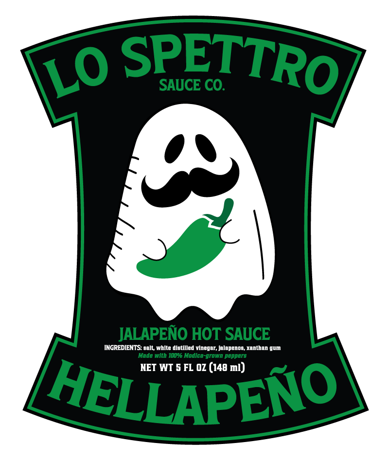
Hellapeño: A stylized jalapeño pepper — the only flavor without any red tones — relying instead on greens, blacks, and neutral highlights to convey heat without cliché color signaling.
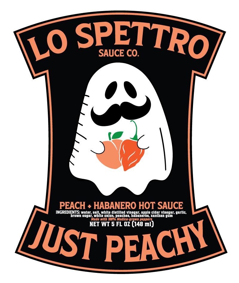
Justy Peachy: A warm, soft peach illustration emphasizing sweetness and balance.
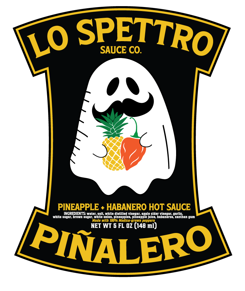
Piñalero: A bold, spiky pineapple shape to suggest brightness and acidity.
3. Palette Strategy
Color is intentionally flavor-specific rather than uniform:
Hellapeño: Greens and deep neutrals — a clean, modern look that avoids the typical “red-=-spicy” trope.
Justy Peachy: Peach and soft orange tones for an inviting, fruity feel.
Piñalero: Yellows and greens for an energetic, tropical vibe.
This approach keeps each label visually distinct while maintaining a shared visual language.
4. Typography & Layout
Bold, straightforward titles ensure quick shelf readability.
Supporting text is kept minimal to let illustrations take the lead.
Label compositions follow the same structure so the series looks intentional and unified when displayed together.
Process
The full design arc — from sketching the mascot scenes to refining vector shapes, selecting palettes, and finalizing print-ready layouts — took about two weeks.
Outcome
Reception has been strong and positive, with customers responding to both the mascot’s character and the clarity of each flavor’s identity. The ghost logo successfully anchors the product line, making Lo Spettro Sauce Co. recognizable even across different colorways and ingredients.